Measuring Bernie’s Coattails
How to Use Data and Open-Source Software to Figure Out Where to Focus Our Energy in 2020.
A Bernie Sanders victory in the Democratic primary would be historic. But even if he were to take the White House, winning without a strong progressive legislature behind him would leave Sanders in hostile territory, unable to enact many of his bold policies. As DSA has already endorsed Sanders, his presidential campaign will no doubt draw many new members to the organization, as we saw in 2016. But the difference this time around is that we have the opportunity to plan for how we want to use this burst of energy.
As a national organization, DSA should leverage the 2020 both to win the Democratic primary for Sanders and also to elect down-ballot socialist legislators who can help him enact sweeping change once in the White House. I suggest here some practical steps we might take, using open-source mapping software, to measure Bernie’s coattails to make sure we don’t miss the opportunity.
As a national organization, there is plenty of opportunity to lend volunteer hours and resources to chapters running electoral campaigns in key states and districts. And, with a more focused effort and fundraising for DSA’s PAC, we can plan to invest heavily in strategic races. We’ve already experimented with this type of coordination as an organization by introducing geographically-distributed phone banking for nationally-endorsed candidates: in 2018 DSA members across the country helped make calls for congressional and state legislative primary candidates in Hawaii and Arizona, and more recently remote phone banks were set up for Irma Corado in Virginia, and for Tiffany Cabán’s primary race for DA in Queens. In a race like Cabán’s, where the result was too close to call on election night, the ability to provide support from a national organization through phone calls and fundraising can be decisive.
But first we have to figure out where those strategic races are. To do this, we can take into account a number of factors: Where is support for a Bernie-style political program strong? Where is the establishment is probably not minding the store (think AOC vs. a 10-term incumbent)? Union density? Income distribution? The good news is that there is a massive amount of easily accessible data out there thanks to the Census Bureau to help us make sense of this political landscape. And it is easy and fun to make maps out of it with open-source software like QGIS.
In 2020, more people will turn out to the polls than in non-presidential years, so there is a real chance to mobilize for down-ballot candidates. Running a state legislative or congressional race for a primary candidate whose platform dovetails with Sanders’s can help to win support for both, because voters will connect the same issues that they care about to both candidates.
Some initial polling suggests that Sanders’s base is roughly balanced on gender and race, but skews younger, less educated, and lower income than those of other Democratic primary candidates. Identifying potential voters within these demographics can be a worthwhile targeting exercise.
Ultimately, choosing to run a candidate for any office will depend on many things besides demographic and historical election data. But knowing how to access and use these types of data can be useful in determining strategy both before you decide to engage in the race and once you have a candidate in the running, because with access to ward or precinct-level data we can determine canvassing target areas. Using and manipulating data like this doesn’t have to cost money, and it doesn’t have to be difficult.
A great place to start is QGIS. QGIS is open-source software that allows you to tie data to geographic boundaries as defined by shapefiles. The Census Bureau makes these files available annually. In the Census’s archive, there is a PDF file that explains which folders contain which types of maps. You’ll likely want counties, congressional districts, and/or state legislative districts (to know which state you’re looking at in the SLDL (lower chamber) and SLDU (upper chamber) folders, you will need the state’s 2-digit ANSI code if you don’t have those memorized). Once you’ve downloaded the file directory from the Census Bureau into QGIS, the .shp file (the shapefile) is what contains the boundaries of the geography to load into QGIS to create a map. To add files as layers into your project, find them in the browser pane on the left and just drag them down into the layers pane.
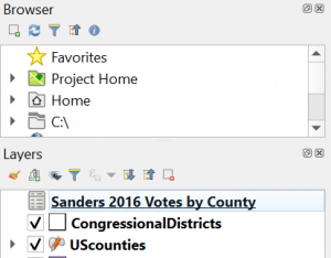
Browser and layer panes
When you add the shapefile for US Congressional Districts, It will default with a solid color fill and look something like this:
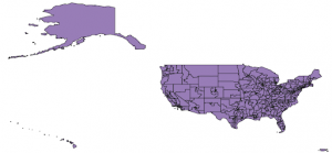
US Congressional district outlines
Once you have your boundaries, you can use the selection tools to remove any areas you might not be interested in. If you add multiple layers, you can change toggle the visibility of map layers on and off in the layers pane, and change the order in which they stack. You can also tie other types of data to visualize in your map by matching to the unique ID for the area. In the case of counties this is a 5-digit FIPS code, and for congressional districts, it is a 4-digit code noting the state then district number (most data published by government agencies will have these types of numerical IDs included, but if you are getting data from another source you might need to bridge the IDs to match by manually creating them in Excel. This reference page is helpful for understanding the types of IDs). To add additional data to your shapefile, add your additional data CSV file (a common data file type. When you download data from the internet, it’s often in comma-delimited or .csv format, or another type of text-delimited or .txt file) as a layer, and then perform a join based on the matching field on the “joins” tab in the properties of your shapefile layer–see below.
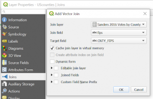
Adding data from a CSV by join
The quickest, dirtiest proxy for probable Bernie-support in a congressional district is his vote share in the 2016 primary. The 25+-way race for the Democratic nomination in 2020 complicates things slightly, but we can expect that votes for Bernie in 2016 when his name recognition was much lower correspond to a mix of support for his program and fatigue with the Democratic establishment. You can download 2016 primary results from here and match it to a county shapefile using a FIPS code.
Once you join those two data sets in QGIS, you can assign a style to show different colors based on Bernie’s share of the 2016 primary vote. Here’s an example I made of a Bernie-vote heatmap with the outlines of congressional districts overlaid (white states are where the primary data was not mapped to FIPS code but precinct instead; you would just need a shapefile of those states’ precincts to complete the map).
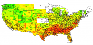
2016 Sanders Vote-share by county (10-pt equal interval gradient: Darkest red = 0-10%, Darkest green = 90-100%)
So right away we can see that there are several early primary states where Bernie did well in 2016: New Hampshire, Colorado, Oklahoma, and Utah (plus Minnesota and Vermont which I didn’t map). If Sanders is going to clinch the nomination away from the other contenders, he needs to come out strong in the first few primary states, and especially on Super Tuesday. DSA chapters should work to make sure those states deliver for Sanders again in 2020, and those states could also be candidates for running down-ballot races.
Though congressional races are sexier, they aren’t the only races worth looking at—state-level races can be more feasible for DSA chapters to run candidates, not just because of the lower price tag, but because state legislatures have sweeping powers to pass increased minimum wages, labor protections, and housing policy.
The National Conference of State Legislatures (NCSL) publishes an annual report on the partisan composition of state legislatures and governorships. Popping two or more of these tables into a spreadsheet makes it easy to see where Democrats have gained and lost control over the past few cycles, and to identify where there is near-parity in the various chambers. There are plenty of sites that make it easy to convert from PDF to Excel or CSV; I happen to use this one. The NCSL also puts out numerous other reports on topics from healthcare to ethics to immigration that can help show where reforms are needed at the state level (like this helpful chart of right-to-work states).
So, let’s take a look at Colorado because its shape makes it easy to look at, and because there was a huge Democratic upsurge in 2018 that may have made room for more progressive candidates. You can pull out information on the makeup of state legislatures right from Wikipedia. I grabbed the Colorado House and Senate info, put it into a .csv file, and used the district number to join it to the shapefiles of these districts.
The map below uses grayscale to show county by county where Bernie’s 2016 vote share was highest (darker = more support), and the district numbers and boundaries for Colorado’s House of Representatives are overlaid, with red and blue representing party control. Districts 14, 15, 19, 20, and 21 are currently Republican-controlled, but potentially targets for a candidate running on a Bernie-style platform because of the relatively high support for Sanders in 2016. State-level races often have lower turnout and interest than federal or presidential elections, which means that oftentimes flipping a seat is a matter of mobilizing just a few thousand voters who don’t typically pay attention to those races. In the case of a presidential-election year, down-ballot candidates who are seen as complementary to a presidential candidate can hope to ride the coattails to victory as well.
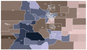
Colorado State House districts 2018 colored by partisan control (Red = Republican, Blue = Democrat) and shaded by Sanders 2016 vote share (10-pt equal interval gradient: Lightest = 0-10%, Darkest = 90-100%)
Similarly, the map below shows Colorado’s State Senate districts, again with grayscale for Bernie 2016 results, but this time only the Senate seats that are up for reelection in 2020 are color-coded by party control. Districts 23 and 25 outside of Denver were stronger for Bernie in 2016 than districts to the south like 4 and 36.
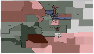
Colorado State Senate districts up for election in 2020 colored by partisan control (Red = Republican, Blue = Democrat) and shaded by Sanders 2016 vote share (10-pt equal interval gradient: Lightest = 0-10%, Darkest = 90-100%)
These examples are just incredibly basic starting points to suggest the type of thinking that we can apply to a primary strategy in 2020. It would be much more valuable after adding things like how much money was spent in the last cycle, where are the longest incumbent runs, and socioeconomic data like education and income.
Much of this socioeconomic data is available from the Census Bureau or from the Bureau of Labor Statistics. You could spend weeks looking through the various surveys on income, employment, industry, insurance, poverty, education, and more. Utilizing the 5-year data sets, if they are available, will give you the most accurate information because sample sizes are largest. For example, you can get data on educational attainment or household income and set the geography breakdown to be whichever areas are of interest to you, whether that’s state, congressional district, or county. When visualizing the data, you’ll likely want to see what percent of a district has a particular attribute (e.g, a color scale to show what percentage of a county has a college degree or less), but it’s useful to keep the raw counts so that you don’t lose sense of the population total.
Money isn’t always the decisive factor in elections, but when trying to mount a credible opposition it helps to know how deep the pockets of the others in the race go. If you want to get a sense of how much funding would potentially be needed to mount a credible campaign, you can look into campaign finance data. The Federal Election Commission puts out an annual summary of all candidate spending for federal elections which you can match to congressional districts based on state and district number. For state-level elections, you need to look a little bit harder. State agencies post their campaign finance filings, but the data isn’t always in a super useful format, and sometimes the websites look like they’ve sat untouched since 2002 (looking at you, Kansas). But for some states there are sites or public projects that make this data easier to use, for example the Virginia Public Access Project has lots of interesting data displayed on candidates and funding.
Running down-ballot candidates with policy platforms that resonate with Sanders’s can help to get both candidates elected during the primaries, and campaigning for both helps to mutually reinforce those messages. All DSA chapters campaigning for Bernie in 2020 should take a look at data relevant to their immediate area and determine where they might have the biggest impact. If we play our cards right, DSA can help to make sure that 2020’s insurgent victories aren’t a blue wave, but a red one.
 Democratic Socialists of America